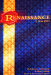
I
came across a stack of old posters that I did when I worked at Grace
College. Some are decent, some are horrendous. But it was fun to
look back and see how things have changed and how much my styles
has changed over the years. Enjoy! |
|||||||||||||||||||||||||||||||||||||
| |
|||||||||||||||||||||||||||||||||||||
 |
 |
 |
 |
 |
|||||||||||||||||||||||||||||||||
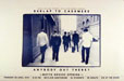
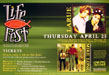
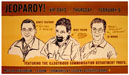
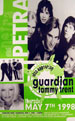
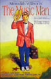
| 1996 - One of the earlier posters. I was a big fan of the swash and Geometric typeface. | 1997 - This one is actually not too bad. I was using Impact and force justify. | 1998 - I am not sure what I was thinking here. A weird splatter thing with a circle and lines... | 1998? - Those are Casey Morgan's hands and my old computer. I was proud of this pic. | 1999 - I was into earth colors and the Frutiger typeface. I liked this poster. | |||||||||||||||||||||||||||||||||
 |
 |
 |
 |
 |
|||||||||||||||||||||||||||||||||
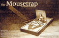
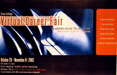
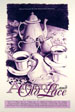
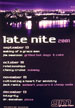
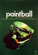
| 1998 - I love the drawing here. Dave Carey drew this from the Grill's Tea service. | 2000 - Dave Carey does acrylic. The coat was blue, but he made the change in Photoshop. | 2001 - Purple and black with the cityscape that I found on the internet. | 2001 - This one was a fun poster to do - red on black and an interesting typeface. | 2001 - Using some old master's artwork for a background gave this a classical feel. | |||||||||||||||||||||||||||||||||
 |
 |
 |
 |
 |
|||||||||||||||||||||||||||||||||
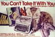
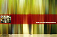
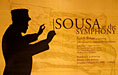
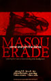
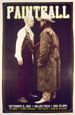
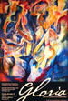
| 2001 - We were going for a royal decree type feel with the wax seal. I like the colors. | 2001 - I enjoyed this poster - very minimalist and striking. | 2002 - This was more of an old west shootout style. Doug was the resident cowboy. | 2002 - Complete cheese here - designed badly on purpose... This was a 30 minute job. | 2002 - This sparked the idea for the Gloria poster later on. Love the color of the Kandinsky. | |||||||||||||||||||||||||||||||||
 |
 |
 |
|||||||||||||||||||||||||||||||||||
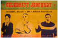
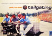
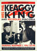
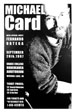
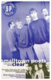
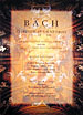
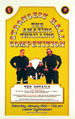
| 2002 - Scott Devlin and I set this one up. It was a fun shot to take, and he enjoyed the pizza too. | 2002 - One of my favorite artists, Tim Young allowed me to use Psalm 150 for this poster. | 2002 - Corny tagline, but we had fun with this one. | |||||||||||||||||||||||||||||||||||
|
|||||||||||||||||||||||||||||||||||||